

Hello there,
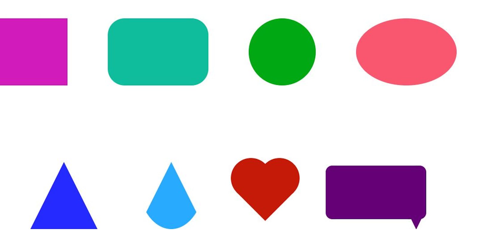
In this post we will be talking about creating basic shapes in HTML & CSS. Many beginners face issues while working with CSS, so I have got 10 CSS shapes that we can create easily.
So, without further delay. Let's Begin.
1. Square
<div class="square"></div>
.square {
  height: 100px;
  width: 100px;
  background-color: #d1bb03;
}
2. Rectangle
<div class="rectangle"></div>
.rectangle {
  height: 100px;
  width: 150px;
  background-color: #d11bbb;
}
3. Rounded Rectangle

<div class="rounded-rectangle"></div>
.rounded-rectangle {
  height: 100px;
  width: 150px;
  border-radius: 25px;
  background-color: #0fbd9c;
}
4. Circle
<div class="circle"></div>
.circle {
  height: 100px;
  width: 100px;
  border-radius: 50%;
  background-color: #00a913;
}
5. Circle
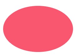
<div class="oval"></div>
.oval {
  height: 100px;
  width: 150px;
  border-radius: 50%;
  background-color: #f95670;
}
6. Half Circle
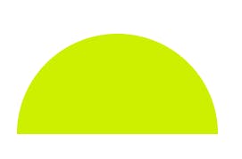
<div class="half-circle"></div>
.half-circle {
  height: 75px;
  width: 150px;
  background-color: #cdef00;
  border-radius: 50% /100% 100% 0 0;
}
7. Triangle
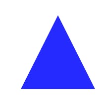
<div class="triangle"></div>
.triangle {
  height: 0;
  width: 0;
  border: 50px solid transparent;
  border-bottom: 100px solid #252aff;
}
8. Cone

<div class="cone"></div>
.cone {
  height: 0;
  width: 0;
  border: 50px solid transparent;
  border-bottom: 100px solid #27aaff;
  border-radius: 50%;
}
9. Heart

<div class="heart"></div>
.heart {
  height: 60px;
  width: 60px;
  background-color: #c51a08;
  transform: rotate(45deg);
  position: relative;
}
.heart::before, .heart::after {
  content: '';
  background-color: inherit;
  height: inherit;
  width: inherit;
  display: block;
  position: absolute;
  border-radius: 50%;
}

.heart::before{
  bottom: 30px;
}
.heart::after {
  right: 30px;
}
10. Callout

<div class="callout"></div>
.callout {
  height: 80px;
  width: 150px;
  background-color: #660077;
  border-radius: 10px;
  position: relative;
}
.callout::after {
  content: '';
  border: 15px solid transparent;
  border-top: 30px solid #660077;
  position: absolute;
  bottom: -30px;
  right: 0px;
}
Feel free to add your thoughts in comments.